Shippo
only here to check bye pedia
Towns Folk
first anyone can add tips or even ask for tips.
first i want to show you the difference in using darker colors in your piece to Add negetive space.
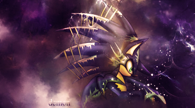
these are examples basicaully it looks in parts like it goes further in to your signature and doesnt make it look flat^


this to me any way makes my smudging flat doesnt give it a 3d feel the darker colors in it^


this is why you should not use black as a color. what happen is it take the depth out^
because i am a smudge artist primary use the render or stock to do my work it important that choose stock and renders with out flat black or white . as a primary choice in it.
i know that this is a advance step
i will be add tips as i think of them and it going out of order
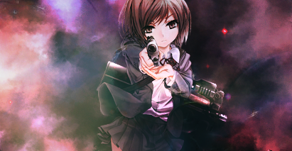
first i want to show you the difference in using darker colors in your piece to Add negetive space.


these are examples basicaully it looks in parts like it goes further in to your signature and doesnt make it look flat^


this to me any way makes my smudging flat doesnt give it a 3d feel the darker colors in it^


this is why you should not use black as a color. what happen is it take the depth out^
because i am a smudge artist primary use the render or stock to do my work it important that choose stock and renders with out flat black or white . as a primary choice in it.
i know that this is a advance step
i will be add tips as i think of them and it going out of order
Last edited: