Contest Transparency/Rendering contest enter and win pc

  • Thread starter Shippo
  • Start date
Shippo

Shippo

only here to check bye pedia
Towns Folk
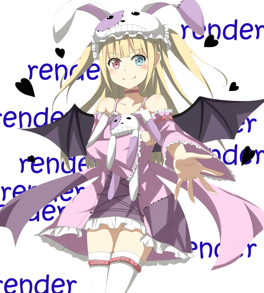
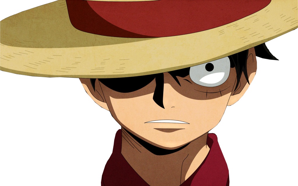
Simply put transparency/ renders are to gfx artist a image with out a background. it makes it so that we can use an images and create our on background and depth.

render:
stock

Rules
  1. the render must be your own
  2. post both the render and stock
  3. if you get the stock from deiventart.com ask for permission if artist request it
  4. must put in spoiler tags [ spoiler ] [ /spoiler ] without spaces
what i am looking at when i am judging?
  1. difficulty - did you render hair or a difficult background
  2. is it choppy. is your outline there and is it smooth
  3. is it use able
what you win ? of course that important
  1. you win 50pc
  2. i will also use your render in a signature and/ or avatar for you if you wish
deadline : hmm! i like at least 3 or more people to enter before i decide on who wins sept.26 aka friday
 
Last edited:
  • Like
Reactions: CrazyElf
Not the best thing on the world, mostly considering the source picture quality, but here's a little entry:

01.jpg
02.png
03.png
 
i like the first more in my opinion
 
Erm, can I add 3D Renders? If yes that would be great.
 
you mean can you do a 3d render yes if you have the orignal copy
 
Here's my submission! :") I'm still new to this, but...
1)
Suzuya.Juuzou.full.1734621.jpg


2)
34320_anime_scenery.jpg
Suzuya.Juuzou.full.dunh.jpg

(File too large, so click this link. > x < )

For some reason, when I uploaded the files, the rendered graphics got distorted... The shadow parts on the shirt, they were much more fine and detailed, plus texture overlay is blurry... ;-;
 
it should be noted that zerochan links are horrible so you can go there and get the link and post it or download it and use photobucket or another photosharing site @Kaidan
 
Last edited:
I don't have adobe photoshop so there wasn't any magic lasso ^^
i had to do it by hand using a normal lasso but i think its sill quite good

i think i did it correctly, if not please tell me what i did wrong XD

RENDER.jpg

RENDER1.jpg
 
you dont have to do state render in the back ground i did it to show that i cut it out sometimes on sites it hard to tell even in spoilers. believe it or not magic lasso works ok but in small areas i use it the switch back to lasso and remove the parts of the render it selected
Here's my submission! :") I'm still new to this, but...

(File too large, so click this link. > x < )

For some reason, when I uploaded the files, the rendered graphics got distorted... The shadow parts on the shirt, they were much more fine and detailed, plus texture overlay is blurry... ;-;
if your saving in jpeg that why always save in png
 
Last edited:
  • #10
Was a struggle for me to find something to render, then I just decided to go with a Nicki image :bag:. I'm not too sure if I'll use this one as yet, but this is what you want, right?

tumblr_mmeiy2_Xhig1rbje98o1_1280_1.jpg

tumblr_mmeiy2_Xhig1rbje98o1_1280.png

:bag:
 
  • #11
yep
 
  • #12
does my profile pick work as one and if so what else do you need me to do
 
  • #13
does my profile pick work as one and if so what else do you need me to do
nope you need an image and render it out like the ones above
 
  • #14
Merli_final_LQ_byCarnelian.jpg

merli_render_by_kagamine_rin_len_v3-d80gqgy.png

The render turned out a little choppy in parts in the end, but hopefully it shouldn't be too bad.
 
  • #15
Well, this is my first ever render so... sue me.
Stock:
wBytiF0.jpg

Rendered:
Rendered_zps4e4ffadb.png
 
  • #16
Stock
1352431491581.jpg
Render
conestmagica_copy_by_kokuren7-d80hdll.png
 
  • #17
ok times up: i am going to rate and decide the winner. rates are numbered with zero being bad and 5 being great
erixsan- diffculty 3.5 rendered 3.7 usablity 3.5 it be better if you kept it at version one for me
Kaidan-diffculty 4.0 usabilty 4.5 rendered 4.7
wolf- diffculty 4.0 render 4.2 usability 4.3
reece -diffculty 4.7 render 2.0 usability 1.5 real life images are harder to render as they dont have a defined boarder
rin- diffculty 4.5 render 3.0 usability 3.2 if it were bigger you have alittle better controly your cuts good job though
alex- diffculy 3.8 render 2.8 usability 2.8 um cant use it cause it just be a head compare to your source it looks like you cut his body off
korkuren7- difficulty 3.8 usability 4.3 render 4.3 a little choppy but usable

winner is kaiden
i seen way worst then i see here guy excellent job! if you like for me to do another contest let me know
 
  • Like
Reactions: Kaidan, Wolf and Mikaya
  • #18
ok times up: i am going to rate and decide the winner. rates are numbered with zero being bad and 5 being great
erixsan- diffculty 3.5 rendered 3.7 usablity 3.5 it be better if you kept it at version one for me
Kaidan-diffculty 4.0 usabilty 4.5 rendered 4.7
wolf- diffculty 4.0 render 4.2 usability 4.3
reece -diffculty 4.7 render 2.0 usability 1.5 real life images are harder to render as they dont have a defined boarder
rin- diffculty 4.5 render 3.0 usability 3.2 if it were bigger you have alittle better controly your cuts good job though
alex- diffculy 3.8 render 2.8 usability 2.8 um cant use it cause it just be a head compare to your source it looks like you cut his body off
korkuren7- difficulty 3.8 usability 4.3 render 4.3 a little choppy but usable

winner is kaiden
i seen way worst then i see here guy excellent job! if you like for me to do another contest let me know
Congrats
 
  • #19
Congrats @Kaidan on winning the contest! Well deserved :)
 
  • #20
Congrats on your win Kaidan! you did great! the others did well too, good try! ;)
 
Back
Top