Install the app
How to install the app on iOS
Follow along with the video below to see how to install our site as a web app on your home screen.
Note: This feature may not be available in some browsers.
You are using an out of date browser. It may not display this or other websites correctly.
You should upgrade or use an alternative browser.
You should upgrade or use an alternative browser.
What do you think of Google's new look?
- Thread starter 18
- Start date
 . It's just gonna take sometime to get used too. But I love that they showed the previous googles too.
Gecko
Son of Anarchy
Towns Folk
Seriously? Google is getting a new logo? Gonna have to move over to Bing... Because Its Not Google ") if you catch my drift lol... anyway, that was really bad, so ignore it
if you catch my drift lol... anyway, that was really bad, so ignore it  I'd rather not have a new Google logo, since the old was awesome, so I actually agree with @Spinnerweb on this one. The new logo'll suck .-.
if you catch my drift lol... anyway, that was really bad, so ignore it I'd rather not have a new Google logo, since the old was awesome, so I actually agree with @Spinnerweb on this one. The new logo'll suck .-.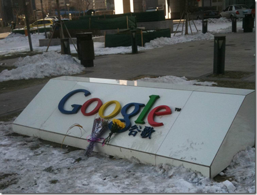
Slayerpon Tatsu
The Nopon King of EXP and Hater of Ignorance
Banned User
That's a fair point that @Artisan makes. Why can't we choose the design that we prefer
Starry Windy
Everything will be Daijoubu.
Towns Folk