Install the app
How to install the app on iOS
Follow along with the video below to see how to install our site as a web app on your home screen.
Note: This feature may not be available in some browsers.
You are using an out of date browser. It may not display this or other websites correctly.
You should upgrade or use an alternative browser.
You should upgrade or use an alternative browser.
Show Off shippo's art gallery
- Thread starter Shippo
- Start date
Shippo
only here to check bye pedia
Towns Folk
Last edited by a moderator:
Marc
"Marc's the sugar daddy of gaming" - Artisan 2020
Forum Management
SMT: Devil Survivor Overclocked, nice. Personally, I think red fits better when it's Devil Survivor Overclocked

Marc
"Marc's the sugar daddy of gaming" - Artisan 2020
Forum Management
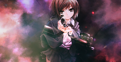
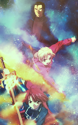
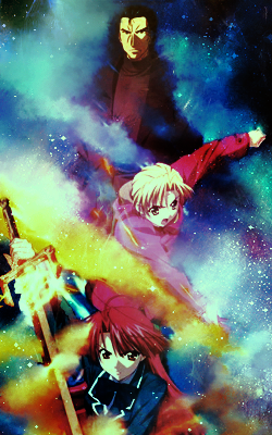
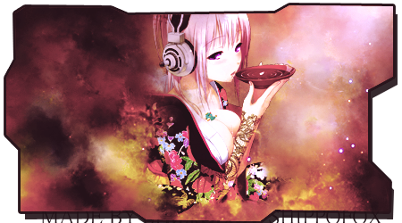
#1 - For the Yuzu sig, idk but I'm more into "red" when it's SMT DS O - [example]. Not bad though.
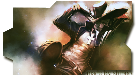
#2 - The red hair guy sig looks awesome.
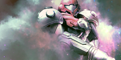
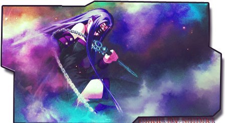
#3 - It's okay. I can't really see her sword >.<
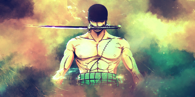
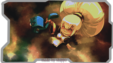
#4 and #5 - Really good.
#6 and #7 - I like them the least
#2 - The red hair guy sig looks awesome.
#3 - It's okay. I can't really see her sword >.<
#4 and #5 - Really good.
#6 and #7 - I like them the least

Alex
#1 Communist
Towns Folk
Number 2 is called Eustass Kid#1 - For the Yuzu sig, idk but I'm more into "red" when it's SMT DS O - [example]. Not bad though.
#2 - The red hair guy sig looks awesome.
#3 - It's okay. I can't really see her sword >.<
#4 and #5 - Really good.
#6 and #7 - I like them the least

And how is Mihawk your least favorite? Damn you.
Alex
#1 Communist
Towns Folk
The only problem I see is that the text is too hard to see. The signature itself is pretty coolthe bottom is my least favorite. the render uses to much black and it screws on the blend process

Shippo
only here to check bye pedia
Towns Folk
Marc
"Marc's the sugar daddy of gaming" - Artisan 2020
Forum Management
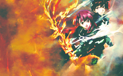
Really liking the last one - http://i96.photobucket.com/albums/l161/gfxdemon86/bang_zpsb032aa54.png
Not really liking the border color for this one though,
Not really liking the border color for this one though,

Marc
"Marc's the sugar daddy of gaming" - Artisan 2020
Forum Management
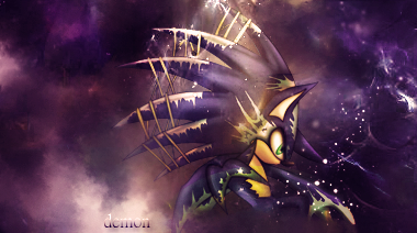
http://i96.photobucket.com/albums/l161/gfxdemon86/sonicdemon_zpscccc55fb.png
^ It's a bit difficult to read the text :/
I'm not really a fan of Sonic so I'll just leave it at that
http://i96.photobucket.com/albums/l161/gfxdemon86/poke_love_by_shippofox86-d7tve6j_zpsfb15a9fd.png
^ I love it. Enough said,
As for the contest sig - http://i96.photobucket.com/albums/l...erLopezMarioTestinoPhotoshoot_zps416cffc9.png
^ It looks nice (as well as the avi / I prefer this version to the other ones here and here).
^ It's a bit difficult to read the text :/
I'm not really a fan of Sonic so I'll just leave it at that

http://i96.photobucket.com/albums/l161/gfxdemon86/poke_love_by_shippofox86-d7tve6j_zpsfb15a9fd.png
^ I love it. Enough said,

As for the contest sig - http://i96.photobucket.com/albums/l...erLopezMarioTestinoPhotoshoot_zps416cffc9.png
^ It looks nice (as well as the avi / I prefer this version to the other ones here and here).







 [URL=http://s96.photobucket.com/user/gfxdemon86/media/bang_zpsb032aa54.png.html]