SaToRi
Nintendo 3DS Legend
Towns Folk
ahh deadlines...i hate those -_-
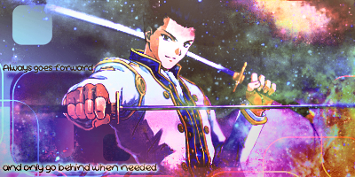
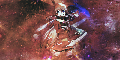
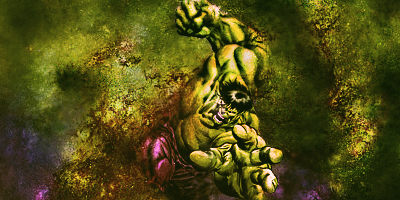
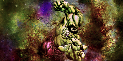
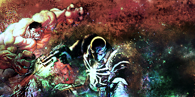
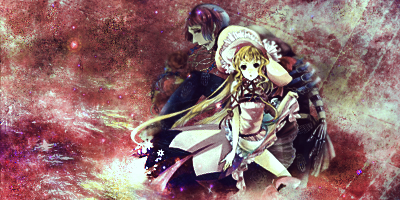
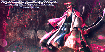
yeah, it's kind of bad to make your text the same color as half the sig. You wanna bring out more than 1 color in a tag. bringing out around three colors is better. makes more appealing tags. The thing is, was that the "&" is pink, which makes for good typography and depth to the text, but it was executed bad seeing as how the rest of the text is hard to read. well nto your fault. i'm just saying the only thing i can complain about lol.
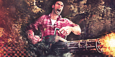
also watch contrast..the whole tag has the same shades of light. if you wanna make more advanced cool tags. work on contrast. make some parts of the sigs lighter, and darker. use ajustment layers, and burn dodge tool.

